An aesthetically pleasing project facilitates the communication of good ideas.Follow this little guide to the best photo practices in order to have a project that’s in top form.
#1 When taking photos, use a tripod or rest your equipment on a stable surface.
If you can’t do either one, at least take something to lean on and hold your breath so you don’t shake.It is essential to have clear photos on order to present your project well.
#2 For photos taken inside, use lamps in your living room to light up the subject better!
If you use several of them in different places around the room you will be able to control shadows better. Avoid flash as much as possibme, which has a tendency to flatten the image.

#3 Outside, morning light and afternoon are generally the best. If the light is too strong, don’t hesitate to use the flash! This may seem strange, but it works quite well.
#4 Take test shots, lots of them and use the best ones.
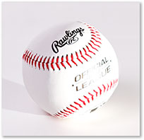
#5 Use plain uncluttered backgrounds. If you have to take pictures of objects for your project, think hard about the background you will use. Dark colours are often inadequate because they are difficult to manage in terms of light and have a tendency to hide your object


In general, white is a safe option.
N.B : don’t forget about the white plastic garden table!
Oh and thank you Ebay for the pictures!
Your main picture is the most important photo! As is often said, it gives personality to your project. It must work as well big as it does small, since we reduce the proportions to represent your project on the site.
For this reason, avoid adding too much text, it’s not aesthetically pleasing and it will be illegible.
The required format is 640x360 pixels.
For those who already know something about graphics, you know that the colours are the elements which allow us to translate the visual atmosphere of an idea or project. Certain colours work well together and others not so much. There are sites which help you to define a colour palette that works , those such as Adobe are well made.